Chapter 9. Design Briefs
![]()
A document describing the design problem and establishing a foundation of objectives, principles, and requirements.
A design brief is a document prepared at the beginning of the project to summarize its objectives and parameters from the design perspective. To varying degrees, it:
• Articulates the objectives of the project
• Positions the project in a larger context
• States the design problem
• Establishes other parameters, like timing
• Summarizes any inputs, like technical, content, or user requirements
• Defines the direction or approach the designers will take
The problem with design briefs is that they sometimes don’t make an appearance much beyond the initial activities of the project. That is, they are a useful tool for defining the design problem and perhaps establishing direction, but design teams don’t tend to refer to them once they commence “serious” design activities.
With this chapter I hope to rescue design briefs from the virtual dustbin. A good design brief can serve as a reference point throughout the project to ensure alignment with goals and direction, and that designers remain focused on the right problem.
What Makes a Good Design Brief
There’s no fountain of youth for design briefs, but to boil the challenge down into a single idea, design briefs suffer from ambition. Designers think they need to make their design briefs monumental, sweeping, and meaningful with a capital M. While moral and aesthetic weight can make design briefs inspiring, they don’t make for long-lived documents. Why? Documentation, as part of a design project, is not about winning the Pulitzer prize.
It’s about practicality.
Clearly State the Problem
If you do nothing else in a design brief, make sure you state the problem. Looking at design as a matter of problems and solutions oversimplifies the endeavor, but certainly ensures that everyone on the team is working toward the same objectives.
For the most part, you should be able to boil down the design problem into a single statement (or diagram!), but the process of solving that problem will require a more extensive set of statements to frame it up truly. That is, while you can summarize the design objectives in a single sentence, the design brief includes further information (like requirements, constraints, and objectives) to establish a more complete picture.
Examples of single-statement problems:
• The new web-based application for customer service representatives needs to incorporate the functionality of two legacy applications, known as Update and Dispatch.
• The new marketing site needs to provide users with detailed feature information about our mobile product, and allow them to see the range of mobile platforms on which it’s available.
• The current client-server application is ugly, difficult to learn, and out-of-date. The new one needs to take advantage of modern web technologies and design trends.
Each statement gives you a pretty clear idea on what the design team needs to work toward. The remainder of the design brief elaborates on the problem. This process, of achieving a deep understanding of the design problem, is crucial to our work as designers.
In one project from a couple years ago, I completely misunderstood the scope of the project; we were designing two pages, not the two dozen I thought we were. This led us to a very difficult conversation about a month in where we had to clarify expectations. Fortunately, we were supposed to do less than we planned, so this issue was less about “But you’re only paying us to do this much” and more about “Wait, you want us to focus on what now?”
You know, a site map would have really helped.
Pictures, like the diagrams from the first half of this book, can be useful tools in clarifying the problem:
• Site maps: As-is structures that have problems with navigation or poorly classified content.
• Flowcharts: Current business processes or user flows that make it difficult for users to complete their tasks.
• Concept models: Underlying structures that leave out particular pieces of content.
• Personas: User needs that go unaddressed, especially mental models that show gaps in content or features that directly address specific user needs.
A design brief is filled with all kinds of statements, assertions, principles, and guidelines. Use pictures wherever possible to hammer the point home.
Statements Supported by Examples
In articulating the problem and outlining the prospective solution, design briefs make statements about the project to help designers keep their efforts on track.
Design briefs may include statements like:
• Objective: Create increased awareness of our newest product families.
• Guideline: Always display products with photos that show them being used by actual people.
• Requirement: Our user research shows that people want to compare products.
All useful principles. You can further enhance their utility by supporting them with examples, which makes for a more powerful design brief. Give readers, in other words, something to hang their hat on.
Picking examples can be difficult. They need to walk a fine line between providing a good illustration of the principle and being accessible to project stakeholders. Need to show how a large site establishes a content strategy? News sites like CNN.com or WashingtonPost.com might provide great examples, but the stakeholders behind a high-tech marketing site may not be able to relate, even though the challenges overlap. Here are some ideas on how to pick examples.
Where examples come from
A design brief should not be a competitive analysis. It might draw on the results of a competitive analysis, but its mission is broader. So, while the competition provides a rich source of examples, the design brief needs to walk a fine line between illustrating principles and setting direction for the design team.
Competitive sites need not provide the only source of examples. It’s a good idea to use other examples with which your team and stakeholders will be familiar:
• Other sites: There are the canonical web sites (Amazon.com, for example, or CNN.com) that provide a common experience to draw from. (Even people for whom the web is not all-encompassing have bought something on Amazon.com.) They also tend to be trendsetters in terms of design, so new patterns usually emerge there first. At the same time, their success and usually conservative approach to design generally means that design patterns on those sites are best practices.
• Other kinds of products: Like canonical sites, there are interactive products (phones, digital video recorders, music players, and so on) that everyone is familiar with. They provide a useful reference for interface concepts (like menu systems) and also demonstrate how a product can fit into a larger scenario.
• Other experiences: I like drawing comparisons to other experiences, like borrowing a book from the library, researching strollers, or planning a home renovation. Simple photographs can evoke these experiences and help people make the connection to this project. No doubt you’ll have someone in your meeting who got into an argument with the librarian just the other day over a late fee, so position these experiences as useful frameworks to consider all aspects of the design.
• Examples are powerful: They can entrench a statement from the design brief (whether objective, requirement, or guideline) deeply into the corporate culture. Having your examples come up time and again during design conversations can be gratifying, especially when one colleague uses it with another. Make sure in setting up the examples you extract the general principles, such that an example doesn’t become, “We want to be just like Amazon!”
Using examples
There are two approaches for illustrating statements in a design brief, and each is the converse of the other:
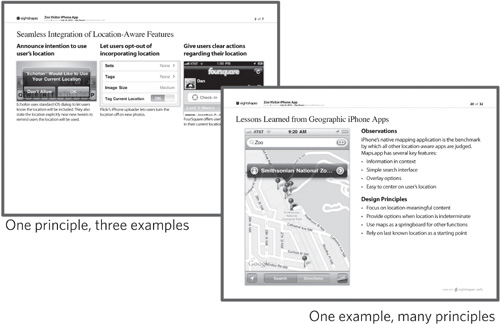
• One statement per page, with associated examples: Each principle (or objective or requirement) gets a single page, and the bulk of the page is for describing the principle and providing one or more examples. This approach is ideal when you are working with a limited set of assertions.
• One statement per page, with associated principles: If a single example can illustrate more than one assertion, you can have each page dedicated to a theme. The example supports the theme, and the page lists all the principles (or objectives, and so on) associated with the theme. The challenge here is to avoid creating a competitive analysis. The principles, guidelines, and requirements don’t describe the example; the example must support them.
Figure 9.1. Using examples to support design principles. Principles can each have a dedicated page or can share an example.
Traceability
The content in a design brief consists of objectives, best practices, requirements, constraints, project parameters, design concepts, design vision, and other assertions that guide designers. In some cases, these statements represent very high-level design decisions that set direction for the project. In most cases, these principles capture the constraints—things outside the control of the designer exerting pressure on the design process, establishing boundaries for the creative effort, and providing criteria by which to judge the result.
Design, in one view, is a series of increasingly specific decisions. Early decisions are “What tasks should we support,” and as the design progresses the team decides what screens are necessary and then how to prioritize the layout of the screen, and then what color the buttons should be. Such decisions have an implied hierarchy: I can’t make one set of decisions without having made previous decisions.
A good design brief, in a word, captures that hierarchy.
A hierarchy of assertions
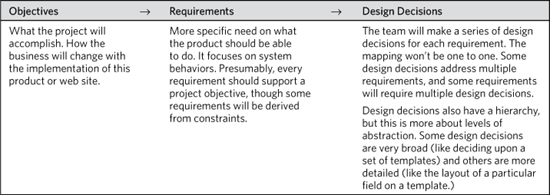
Is there one, immutable, objective Hierarchy of Design Statements? A ladder representing each kind of constraint and requirement, every level of abstraction for design decisions? Beats the heck out of me. But they generally follow the pattern described in Table 9.1.
Table 9.1. The hierarchy of statements suggests that every design decision should trace back to a project objective. In reality, some requirements come from external factors or constraints, yielding some design decisions that appear arbitrary or counterintuitive, but necessary for the success of a project.
It is possible to overthink this. You don’t need a complex hierarchy accommodating every possible design principle that emerges. But you do need to be able to provide a rationale for design decisions. Designers who expect “Because I said so” to be a legitimate justification for a design will have to wait a long, long time for that to be true.
Instead, having an airtight decision-making process means demonstrating that you’ve considered different approaches, landed on the one that solves the problem best, and justified the approach by referring to prior decisions.
Reflecting the hierarchy
The brute force approach to referencing earlier material is to number items as granularly as possible and then embed those identifiers as appropriate in the document:
• On a flowchart, reference requirements identifiers to show which parts of the problem are being solved.
• On a wireframe, reference standards identifiers to show which components from the library are being used.
• In requirements, reference objectives identifiers to justify the inclusion of specific features and functions.
Such references are useful only in so far as they demonstrate thoroughness and attention to detail, and some project teams may need this rigor.
On the other hand, while putting together these references can be painstaking, the real problem is that they are abstract. In the context of a wireframe or screen design, citing requirement IDs provides no real context. (Except maybe for the person who wrote and encoded the requirements document.)
One way to overcome the abstraction is to be explicit, listing references in full adjacent to design decisions. Of course, a complete list of requirements on a wireframe is impractical. (The requirements may change, there may have been some intervening interpretation of the requirements, and frankly, there may not be enough room on the page of your deliverable.) Instead, I will use sentences or phrases that summarize a set of requirements or objectives.
Figure 9.2. Simplified objectives statements allows me to reference them throughout the design process. A statement can evoke prior conversations about objectives and principles, whereas an abstract identifier separates the design from the rationale.

The exception: design standards. My firm has worked with many design teams that have started building internal standards libraries. In such repositories, a systematic codification of standards can become embedded in the language of design. Teams will become comfortable referring to design components by code, especially if the rationale behind the encoding is meaningful.
Articulated Boundaries
A good design brief draws a line around the project to clarify what the design team should and should not work on. Boundaries are crucial because creative endeavors can easily explore design problems ad infinitum. Boundaries are what let design teams get pragmatic. Two typical ways to express boundaries are in terms of time and features. One reason why I rely on these approaches is that they can be expressed as pictures.
Schedule
Perhaps the simplest way to stop a project is simply to name a date when everything has to be done. A well-managed design team should be able to triangulate “what’s possible” from “objectives” and “deadlines.” The design brief should clearly state any predetermined deadlines.
Features
Another way to establish a focus for a project is to identify which pieces of the experience the team will address. A prioritized feature list is a good start, but a more detailed view into features may be easier:
• By screen or template: One typical way for us to establish the scope of a project is to say that we’re focusing on one set of screens (sometimes even just one screen). Though translating a feature into a distinct quantity of screens is difficult, it can provide enough of a level of effort estimate for the purposes of a design brief.
• By user scenario: A more abstract way to establish scope is to describe what set of user behaviors we need to design for. Also difficult to define, but perhaps a more realistic quantification of user experience, scenarios allow us to talk in terms of what we expect users to accomplish. A scenario’s complexity (dependencies, inputs, outputs, and consequences) will provide a basis for establishing a level of effort.
Additional constraints
There may be other factors that impact what the team focuses on, how much they can get done, and their timeline. These could include any other logistical constraints, like which team members are (or are not) available to work on the project. Key decision makers out of town during crucial parts of the project will force the team to frame up their deadlines to accommodate.
The corporate culture may come with additional constraints: content vetted by the legal department or other reviewers, specific engineering lifecycles that drive the deadlines, or technological frameworks that impose particular requirements.
The Plan
A good design brief describes how the project team intends to accomplish the objectives within the boundaries. This is the team’s opportunity to take everything they know about doing design and apply it to the specific design problem.
The more specific the plan, the better, but a design brief may not be the right place to capture every last milestone. High-level plans—sketching the primary activities, deliverables, responsibilities, and hand-offs—are usually sufficient for a brief, so long as they lead to more specific plans. These are the things a plan needs to communicate, relevant to a timeline:
• Activities: What tasks the team will be performing.
• Deliverables: What the outputs of those tasks will be.
• People: Who is responsible for performing the tasks.
Remember, a plan is meaningless without objectives. The main message in a plan is how it drives toward objectives.
Ever-evolving
While design briefs should be the foundation upon which all design is built, doing design means having an increasingly intimate understanding of the challenge. It means refining and elaborating the vision and principles to provide more specific guidance and design direction.
There are two things that make a design brief easy to update:
• The document has to be structured to allow change: Beautifully produced design briefs set a good tone for the project, but unless there has been a conscious effort to design for change, they are difficult to update.
• The document has to be useful: That is, people need a reason for keeping it up to date. People forget a design brief that isn’t useful.
If the purpose of the design brief is to reflect the design vision, it should never go out-of-date. And if you agree that this is the primary purpose, you should design the document with this kind of flexibility in mind: What if the principles change? What if you add more principles? Have you left room to elaborate on the vision? Have you established criteria to qualify new objectives? Can you add information to requirements as your understanding of the scope evolves? A good design brief is structured to permit these kinds of changes.
Set the Tone of the Project
A good design brief establishes the tone of the project. This is not something that happens explicitly: The document’s executive summary doesn’t include a line indicating that the project’s tone will be light with occasional bouts of seriousness.
Instead, the degree of formality, structure, and polish of the design brief sets expectations on how the project team will communicate. It would be difficult to go from a finely tuned design brief to reams of disorganized and un-annotated sketches.
A design brief can also be a vehicle for introducing the range of project management tools to be used. Project management tools are used to:
• Track “doneness” of different parts of the project
• Plan the activities for achieving objectives
• Refine the scope as the design problem becomes clearer
• Manage risks as they arise
• Document feedback on the design artifacts
• Capture to-do items for various team members
• Assign funding and commitments to different activities
Whatever tools you use to address each of these, the design brief offers an opportunity to provide a gentle introduction. The brief can show an excerpt or sample from the tool. If enough information is available, the tool shown should include baseline information.
Considerations for showing tools
As you present these artifacts, consider adding a layer of information adjacent to the project management tool itself:
• What it’s for
• Who is responsible for maintaining it
• Who should use it
Example: Showing a progress matrix
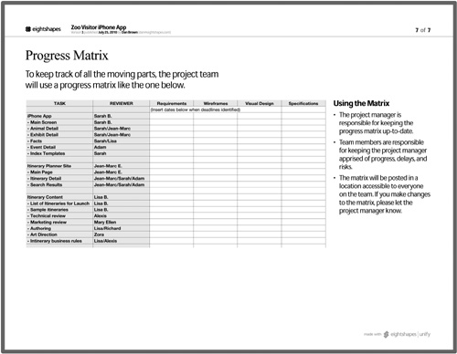
For example, some teams use a matrix to track completeness for different aspects of the project. There are lots of ways to frame a project. One way is by deliverable, but more of my projects have multiple design streams as we pursue different aspects of the design. These are sometimes staggered on purpose at the outset, or later become staggered as feedback rolls in at different paces. In the example in Figure 9.3, we’ve structured the Zoo iPhone app project from Wireframes (Chapter 7) around three main work-streams: the app itself, the supporting web site, and the content creation.
Figure 9.3. A progress matrix can be seeded with sample information based on the initial concept of the project. In this case the matrix is embedded in a page to provide additional information.
Each stream of the design is based on a different piece of the product. The team may have a good idea of how they want to break up a project, but that framework may change during the course of the project. The design may yield a different approach, feasibility assessments may render certain parts of the project out-of-scope, or stakeholders may reprioritize the features.
Moderate Level of Effort
Think about how much effort you want to spend on a design brief. Some considerations:
• Purpose: Every design brief should capture the design problem and objectives and set direction for the design. The document can serve either as a centralized bible used throughout the project or merely as a way to get the ball rolling on the design process. If the latter, plan for less effort on the design brief.
• Overall budget: If you need to dedicate a chunk of your budget to the design brief, you don’t want to eat up too much, sacrificing later design activities. At the same time, design briefs can establish direction for later activities, making them more efficient and focused.
• Inputs: Design briefs may be positioned as a quick exercise at the beginning of a project to align expectations. They may also serve, however, as the summary of a series of requirements, research, and discovery activities.
• Perceived value: I always try to incorporate some initial design concepts in my design briefs, lest my customer think they’re paying me to simply regurgitate the inputs. If your design brief won’t offer much more than capturing the objectives and requirements, your level of effort should err on the lower side.
A reasonable starting point for level of effort is 20 percent of the overall design budget. If you have 400 hours to put together a design, spending 80 on composing a design brief generally works. (Eighty hours is one person fulltime for two weeks. Most people can get a lot done in that amount of time if they have no other commitments.) Much more than this, and you start to encroach on the design endeavor. Much less than 10 percent and you just don’t have the time to wrap your head around the design problem in a way that lets you state it clearly.
Of course, this rule of thumb is just a starting point. Design briefs can be much simpler, or they can require substantial inputs (for example, user research).
Communicate Priority
One of the overall messages of a design brief is that different principles have different priorities. There are various methods for identifying these priorities, but regardless of which you use, the outcome is the same: Some principles have a stronger influence on the design process than others.
Rather than communicate weight explicitly, by assigning some pseudo-quantitative value (numbers or “moon phases” for example), I organize my document around the prioritization. The most important ideas should come first in the document. They should be repeated often. They should appear at the top of lists.
In the next section, Anatomy of a Design Brief, I’ll explore the different kinds of information appearing in this document. Priority is a key message throughout this section, because you may generate dozens of design principles for each type (objectives, guidelines, constraints, requirements, and so on).
Arbitrary lists of principles do not help the design team.
While it may feel like a step in the right direction, numeric weights also aren’t very helpful. The design team will be looking to the brief as a constant source of inspiration and direction. The most important messages need to jump out at them, not be buried among others, a sole bullet or icon the only indicator that this concept is more important than another.
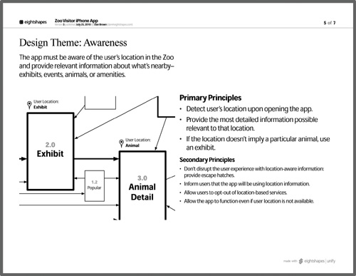
Figure 9.4. Communicating prioritization means using the layout and structure of the document to imply relative importance. In this example, which highlights one of the themes of the design concept, more important principles from the theme appear at the top of the page and are rendered in a larger type size.
Tips for Presenting Design Briefs
If you are the designer preparing the design brief, this may be the first document you share with the project team. If you haven’t worked with the team before, this meeting can feel very important. The project team will be seeing work for the first time. They’ll have the opportunity to provide feedback in real time. They will start to see how the process works. They will get a sense of how well you understand the design problem. They may have high expectations about the initial concepts. And, they may not really know what a design brief is, so they may not be prepared for what you show them.
In short, there’s a lot riding on this conversation, and a lot that can go wrong. (I’ll be honest, these are my least favorite presentations.)
Socialize concepts beforehand
One thing I do to help moderate the risks is talk to my key stakeholders about the content of the brief well before the meeting. This is an opportunity to gauge the concepts, set their expectations about the brief, and solicit feedback about the content.
In such a conversation, you can focus on the high-level pieces of the concept—the vision statement, the design objectives, the primary design principles, the characterization of the scope. Talking to the main project stakeholder about these things, you’re interested in his or her estimation of the project team’s reaction. You may need to ask pointed questions, like:
• Does any of this conflict with the general understanding of the project?
• Is it too soon to talk about these ideas?
• Our vision focuses on the concepts of Proximity, Awareness, and Enrichment. What’s your first impression of those concepts?
• We’ll be presenting a project plan that’s a few weeks longer than anticipated. What do you think we can do to help justify that?
• We’re not presenting any specific design ideas, but we do want to make sure we have the design problem right. Do you think the team will get that?
Another approach I take in this conversation is to share the table of contents. With this, my stakeholder will have a more solid understanding of the range of topics covered in the design brief. He or she can then react to what information might be missing, what might be premature, and which content is going to garner the most focus from the project team.
Depending on your relationship with the project stakeholder, you might share an early draft of the document.
Regardless of whether you get to have this conversation, you can also send around an agenda for the meeting, drawn from the brief’s table of contents. Solicit input on the agenda from the meeting participants to ensure that it addresses all the things they expected to discuss.
Avoid “Ta-da!”
Be careful treating the design brief conversation as an unveiling of a Big Idea—whether that be some initial conceptual designs, some sketches to make sure you have the problem right, or a central vision statement. The sad truth is that no one is ever as excited about your ideas as you are. (And I mean no one, and I have a Jewish mother.) Other members of the project team consider the concept from other perspectives, which may render the concept as, well, disappointing.
Many people come to this meeting with their own idea of what the product should look like. Rarely will you find a project team ready, willing, and able to take ideas that you spoon-feed to them. (Frankly, I’m more suspicious when other team members do not push back on the design ideas.) What you show will inevitably conflict with what they have in their heads. Sometimes it’s a completely different concept, and sometimes their own conception of the web site is more detailed. (From their perspective: “Wow, so much effort to lay out the basics? Where are the details?”)
• Treat the concept as a starting point, a foundation from which the rest of the design will be built.
• Build a strong connection between the design concept and the design problem. In other words, don’t position the design concept or vision as a stand-alone, but as a first step in hashing out the design problem. Show the relationship between different elements of the design problem and how the vision would treat those problems.
• Use the design concept to validate the objectives of the project, and clarify your understanding of what you need to accomplish.
Don’t skimp on logistics
So, if doing an unveiling is a recipe for disaster, how should you focus the conversation? Beyond the tips in the previous section, the conversation around a design brief should address the How. As stated in the Designing Processes sidebar earlier, your role as a designer is as much about describing the approach for meeting the project objectives.
Spend as much time (if not more) describing the scope, activities, deliverables, and points of overlap with other members of the project team. Describe how your design philosophy (presumably the catalyst for hiring you) is realized in the approach.
If you spend the most time on the page of the document that describes the process, consider that the sign of a successful meeting.
Anatomy of a Design Brief
The content of a design brief is the set of principles driving the design project.
Organizing Design Briefs
Here’s a good table of contents for a design brief:
Table 9.2. The design brief should establish the overall vision and themes at the beginning of the document, then elaborate on additional principles and constraints.
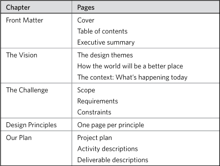
This structure for the design brief follows the general philosophy of documentation laid out throughout the book: It starts with the punch line and digs into details in later chapters.
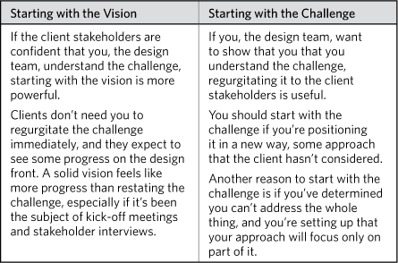
It may be tempting to start with The Challenge, which describes the design problem, and you are welcome to do so. Here are some considerations:
Table 9.3. The vision or the challenge is the “Once upon a time…” to your whole story. Which you start with depends on the current state of the project, the activities so far, and your relationship with the clients.
Design Objectives, Themes, and Principles
One set of principles establishes the design direction. They provide different perspectives on the vision for the project.
In general, the design direction guides designers by providing inspiration and suggestions. At one level, they’re rules that say “always use active verbs for buttons,” and at another they point in the general vicinity of a concept, like “this product needs to help co-workers share information about specific projects.”
As described in What Makes a Good Design Brief earlier, articulating the design direction benefits from moving beyond a simple bullet list. Examples are powerful; they illustrate elements of the design direction and provide context. Some other considerations:
• Classification: Categorizing the principles under different themes (like “navigation”) will help you establish an overall direction for specific areas of the project. Such groupings help designers know which principles to focus on for particular design problems.
• Prioritization: As the project progresses, you may identify a large quantity of principles. Prioritizing them from the outset, giving some principles more weight, will help maintain focus during the design process.
• Language: Principles should be rendered in the imperative voice (verbs that are commands). Use simple statements, and make them as concrete and as specific as possible. “Be friendly” is pretty vague. “Lean toward understated and warm color palettes and geometric patterns” is less vague.
• Sketches: Illustrate principles with concept sketches. My documents frequently contain scanned pen-and-paper drawings.
Vision statements
One way to summarize the overall direction is to establish a vision statement, which defines the central theme that drives subsequent design decisions. This singular sentence or phrase can provide focus for the design effort, making an appearance throughout the process to qualify ideas and new requirements.
Here are some vision statements we’ve used:
• As powerful as you need it to be.
• Building bridges between areas of the organization.
• Let experts escape administrivia and be experts again.
(They may seem meaningless to you, here, now, because you’re not familiar with the specific project. A vision is rooted deeply in the context of a project. Don’t feel like your vision statement has to move the Earth. It just needs to be meaningful to the people involved in the project.)
Frequently, we use a visual metaphor to reinforce the vision statement. A simple statement superimposed on a large photograph is a powerful way to establish the vision.
Design Context and Scope
A second set of principles draws boundaries, clarifying project parameters. Instead of pointing designers in the right direction, boundaries let them know where they should avoid treading. These parameters are more specific to the particular design project, and have less to do with logistics (like deadlines) and more to do with areas of focus. Some considerations for defining boundaries:
• Specificity: If you’re searching for a way to articulate a boundary in a more concrete way, start with quantity. Whether you’re talking about number of screens, number of interface components, or number of iterations, establishing an order of magnitude can help the project team get at least a rough sense of how big the project is.
• Source: Some of these boundaries are more arbitrary than others. Why are we only focusing on press releases for launch? Why can’t we touch the header? Documenting where these scope notes come from can facilitate traceability.
• Weight: Like any other design principle, those that provide context and scope should be weighted.
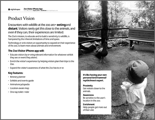
Figure 9.5. A vision statement paired with a photograph can produce a powerful foundation for the design process. Making the photo full-bleed adds further power to the image (in this case an innocent preschooler confronted by a male peacock during mating season).
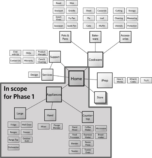
Illustrations also help to communicate scope. Use a site map, flowchart, or concept model to draw the part of the site that you’ll focus on for this particular project.
Figure 9.6. Site map with project boundaries. Using the example from Site Maps (Chapter 5), we can communicate which parts of the new site structure the team will focus on in the first design phase.
Design Concept
It’s easy to picture the design process as spanning two key tasks—understanding the problem and solving the problem. This book makes heavy use of that dichotomy to help clarify the roles of different diagrams and documents. The design process is obviously much more complex, and frankly, not much more needs to be said about it.
A design brief, in reflecting this complexity, doesn’t need to stop at “stating the problem.” Powerful design briefs provide an initial glimpse into the design direction; nothing illustrates a design direction better than the design itself. Not sure you agree? Check out the Wait, What? sidebar.
The design concept should help readers understand:
• The experience, but avoid providing too much detail: This is more a practical consideration. If you had the time and money to flesh out the details, you wouldn’t be working on the design brief. (Conversely, if you have the time and money, you don’t want to blow it all on the design brief.)
• The design challenge: Sometimes a design concept is a good way to illustrate the constraints and issues faced. Design problems become clearer as the design team solves them—why wait until later to uncover particularly sticky issues?
• The scope: A concept can show where you expect the project to begin and end. A drawing showing a new approach to the structure of the site gives a pretty clear indication of what you will and will not be working on.
Exposing design concepts early in the project comes with some risks. The benefits—clarifying the vision, establishing a direction, providing concrete illustrations to elicit reaction—far outweigh those risks. There are some things you can do to keep design concepts from getting out of hand:
• Focus on one screen: Regardless of the size of the application, use only one screen to illustrate the concept. Use an important screen (log-in just won’t capture the direction in the same way), one that captures the essence of the application or the scope of the project.
• Keep it sketchy: If you can’t create a hand-drawn concept, use line styles in your illustration application to render the concept “sketchy.” Delivering a perfectly polished design concept is not appropriate for the brief. It may be tempting to position the brief as “locked up,” but you know as well as I do that your understanding of the design problem will change. A “sketchy” style implicitly communicates a lack of finality.
• Avoid committing to a particular direction: I always position design concepts as throwaway—useful for framing the problem and setting us on the right direction, but requiring substantially more elaboration.
Structural concept
Instead of showing screens in your design brief, you can incorporate preliminary structural sketches—flows, storyboards, comics, site maps, and concept models. While these are useful diagrams for communicating an as-is state, and pointing out problem areas that might be the focus of the project, they can also show how to realize the design vision through structure. Before-and-after flows showing how a new approach to the design better addresses the design problem and establishes an overall direction.
As described earlier, you can use such a model to communicate a plan—which parts of the site or application you plan to deal with first. More generally, such a model can represent a stake in the ground, your first set of design decisions.
Summary of Requirements
Requirements, typically (historically?), are expressed with “The system shall…” statements. I’ve worked on projects that generate reams of paper etched with statements like these, like some errant software engineer being punished by writing inane phrases over and over again on a blackboard. “Shall” statements express the design problem, describing every behavior, business rule, and objective.
While such artifacts are not as common in more recent memory (and yet the psychological trauma remains), the spirit lingers in some corporate cultures. Stream-of-consciousness documents that are meant to capture the design problem have their place (who am I to shift the corporate culture of a Fortune 500 company?), but they don’t serve your purpose as a designer very well.
But let’s not throw the baby out with the bathwater. Requirements define the design problem and let project teams have important conversations about planning, scope, constraints, and feasibility. Requirements don’t have to come from esoteric engineering methodologies. You might also find requirements through:
• User research
• Business needs and objectives
• Operational issues
• Corporate design standards
• Technology
Summarizing all of this information, especially if you have it at the outset, is useful because it further refines the direction for the design team. Some ideas on boiling it down:
• Extract themes: Far be it from me to encourage you to leave out details. Within the scope of a design brief, however, themes are sufficient. For the mobile zoo application described in Wireframes (Chapter 7), for example, the mobile app makes heavy use of geolocation. A detailed technical requirements document might elaborate on every variation. For the purpose of the design brief, stating that the application, well, makes heavy use of geolocation, is likely sufficient.
• Use imperatives: “The system shall…” is so passive. Designers like concrete direction: “Show users that the application is aware of their location.” “Use location data to prioritize content.”
• Express from user’s perspective: Whether or not the requirements derive from user research, you can express them from the audience’s perspective. You can phrase the design problem in terms of what users want to accomplish and what they expect to see.
Generally, I can avoid messing with requirements too much if I can express the design problem in a picture. If I can successfully articulate the design concept (as described in the previous section), I may not need to summarize the requirements at all; the picture is sufficient for generating conversation about what the system can and cannot do.
Summary of Constraints
The line between a requirement and a constraint is thin. Ultimately, both establish a boundary, but constraints are outside the control of anyone on the project team. “The content management system cannot incorporate any new templates within the timeframe for this project.” Constraints are mostly technical, but could also be operational, “The content development team has limited resources and cannot author any new content for this project.” They could be logistical, “We need something online by the end of the quarter in advance of our large marketing event.”
Capturing constraints in the design brief is a lot like capturing requirements. Extracting themes and using imperative voice help. (Constraints do not define the design problem, only draw boundaries around it. They are, therefore, very much not from the user’s perspective.) Here are a couple other things that can help:
Categorization and organization
It’s hard to escape the straight list of constraints. Illustrations and photographs won’t necessarily help you here. This is a case where biting the bullet and starting with a flat list of these things is worthwhile information. If you can build a picture around it, so much the better.
In the meantime, you should capture at least two things about each constraint: where it comes from and what it impacts.
The source of the constraint usually falls in one of these categories:
• Technical: You’re building a product inside a technical platform (maybe even multiple layers of a technical platform), and the design must conform to any restrictions imposed by the platform. For example, the content management system may be picky about the kinds of content types or templates you use.
• Operational: The organization is on the hook to maintain and feed the design long after the project team creates the design. Operational constraints describe the organization’s ability to maintain the design. For example, an organization may have only one person dedicated to editing site content, which would make it difficult to sustain a site that expects lots of new content every day.
• Logistical: Some constraints have to do with the project execution, and usually relate to deadlines or people assigned to the project.
If the constraint isn’t obvious in the implication, you should spell out the area of impact. For example, with a technical constraint in a content management system, you should state explicitly that the project entails creating one new template for the content management system. This will make the constraint clear to anyone reading it in the context of the project.
Standard fields
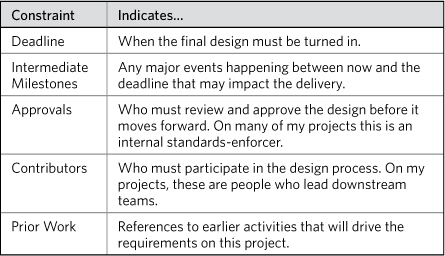
Constraints usually follow a pattern. That is, there are some common ways to establish boundaries around a project. Your design brief template can include a page summarizing these standard fields, described in Table 9.4.
Table 9.4. Standard fields for defining constraints. Remember, these are determined outside the project team. If you have ultimate control over a deadline, it’s not really a constraint, is it?
Late-breaking constraints
Unfortunately, many constraints don’t emerge until well into the design process. Working through the design of the user experience and assessing feasibility of design concepts reveals constraints.
Letting these constraints fall through the cracks can be disastrous. Individually small, constraints have a big impact on the design. The team should maintain a separate tool (a spreadsheet, for starters) that tracks constraints, a checklist constantly updated so the designers have a reference tool at their fingertips. Whether you incorporate late-breaking constraints in the design brief depends on how entrenched that document is with the team. It also depends on how easy the document is to update, and whether the team would benefit from a separate tool.
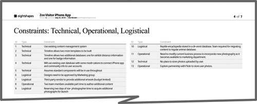
Use a table in the design brief to capture constraints identified at the outset, supporting the table with supplemental illustrations as necessary.
Figure 9.7. A table of constraints in the design brief is easy to update and easy to expand with late-breaking information.
Project Schedule
Besides defining what the project will accomplish, a design brief also should assert how the team intends to get there. As described in the Plan section earlier in this chapter, the essential pieces of information in a project plan are the activities and the outputs. Nothing describes activities and outputs over time better than a Gantt chart.
Gantt charts are diagram outcasts. Appropriated (some might say bastardized) by Microsoft Project, these visual project schedules had their elegance and simplicity drained from them. Bars on a timeline, however, can be beautiful once again, and are great for telling stories.
Great Gantt charts depend on simplicity and focus. And, like any design endeavor, those things start with understanding the target audience.
Tip: Templates for Gantt Charts
EightShapes Unify, my firm’s collection of design and documentation templates for Adobe InDesign, includes starting points for Gantt charts. If you didn’t think Gantt charts could be sexy, you haven’t tried Eight-Shapes Gantt charts.
Needs of the target audience
It can be tempting to incorporate every last detail of the project plan into a Gantt chart, but this approach undermines the overall story. Too many crisscrossing lines, illegible labels, and timelines that spread across multiple pages render these diagrams inaccessible, and make it easy to lose the thread of the story.
A project plan’s focus in the context of a design brief should be those things that project stakeholders care about:
• When do I need to get involved?
• What kind of commitment does my team need to make?
• What am I getting at the end of the day? Am I getting my money’s worth?
• How soon will I have the most tangible design work in my hands?
• Are there additional costs on the project?
To that end, great Gantt charts have:
• Meaningful timelines: Use the width of the page to represent the length of the entire project. (Perhaps you can define this either by what part of the project is funded, or by a deadline established externally.) This may prevent you from revealing the details of individual phases or activities. Create separate Gantt charts for each of those. Practically speaking, you’ll generally only have enough information to create a high-level project schedule across the whole timeline and then a detailed schedule for whatever phase you’re embarking on right now. Your design brief will then have two charts: overall plan and activities right now.
• Right level of detail: On top of the timeline, you need to specify activities and deliverables. Sometimes, you need to specify dependencies between these things. Things get tricky here in determining how much detail to include. Generally speaking, I include activities that have discrete beginnings and endings. If I have the room, I’ll break down an activity into smaller tasks, but I usually just list these in the annotations that accompany the schedule. Every activity should have a deliverable, and I’ll incorporate intermediate deliverables throughout the activity if people outside the design team expect to see them or it will have a major impact on the project.
• External inputs: Sometimes people outside my area of influence (usually other stakeholders or subject matter experts on the client side) are responsible for providing an input to the project.
• Participation commitments: My project plans always show the cadence of regular status meetings, to let stakeholders know what their commitments are.
• Relevant external factors: Team member vacations, for example. There’s a pang of resentment or guilt whenever these things get stated explicitly on the project plan, but the presence or absence of someone on the team can have an enormous impact on delivery.
The One-Slide Challenge
The design brief describes a project’s objectives, the vision for the design, and how the team will get there. It establishes boundaries to help keep the design endeavor focused and documents some of the principles the team will use to drive the design process.
For a document called “brief,” this is a lot of information.
Can you summarize everything in a single slide or single page? Shrinking down your text and artwork doesn’t count.
I’ve heard a simple idea from several different sources, including Dan Roam, who wrote the book The Back of the Napkin. This idea is this: The person who can clearly state a problem or challenge is the person best positioned to solve it.
A design brief captures essential information, and good ones get pretty detailed, and they should not sacrifice that information for brevity. On the other hand, the design brief should include a page that boils it all down, that provides the team with objectives, vision, direction, constraints, and approach, in the space of a single page. From that page, I should understand how the design team will be spending the next few months.
Of all the pages in the design brief, this is where you should spend the most time. (Perhaps second only to those pages that put a stake in the ground for the design direction.) A one-page summary of the project will prove most useful to the team, something they can hang next to their computer. It will help them remember that, as they’re pushing pixels around the screen or digging into recordings of usability tests or adding painstaking annotations to wireframes, they are making an important contribution to a larger effort.
Figures 9.8, 9.9, and 9.10 provide some ideas on what that page might look like.
Figure 9.8. Focusing on the project schedule, the one-pager displays the Gantt chart with overlays to describe the overall approach.
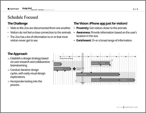
Figure 9.9. Highlighting structural issues establishes clear direction for the project, defining what problems the project team must focus on.
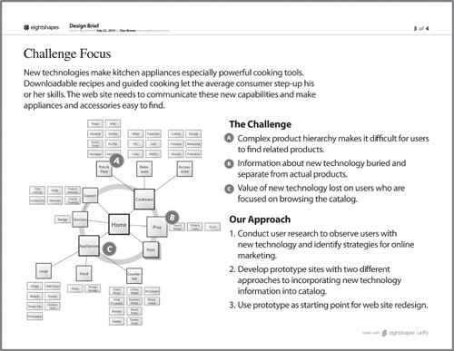
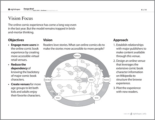
Figure 9.10. Stating the vision for the project can show the project team how you’re bridging the gap between the objectives and the approach. In this case, the concept model is not explained directly. When using diagrams that are more abstract, be sure they’ve already been socialized. This page would not be effective if the project team were seeing the diagram for the first time.
